Commerce7 has welcomed 400+ wineries since acquiring WineDirect's SaaS division. Ready to migrate? Learn More
What a High-Converting Wine Product Page Looks Like
Lucas Machado 4 min
May 19, 2020When you’re walking through the mall, you see nice, great looking showcases with featured products. These showcases have nice decorations, sometimes price tags at the bottom of the pieces, and good lighting to better call your attention to the products they display.
When you’re in a winery tasting room or a restaurant, you have a wine menu that contains the wine information such as origin (sometimes even the story) and how it harmonizes better with certain foods. Often there is a staff member explaining even more than that to you - to assure you’re gonna make the right choice or go for the best purchase based on their recommendations. Everything is done in a way to assure you have the best experience possible and to also make sure you are consuming the wine the way intended.
Providing the same experience with an online store is more challenging – you don’t have a physical menu, you don’t have a waiter or a connoisseur to present the bottles to you or to explain the story behind the winery – but you should still have these same efforts put in practice.
So, how do you do that in the DTC / ecommerce world?
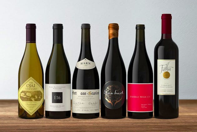
First of all, you need to assure your winery bottle images look crisp, clean, and attractive. This is the first thing that’s going to catch your customer’s attention. The lighting, definition, and colors have to stand out – so that your bottle looks pristine, just as if you were looking at it in your own hands.
High-quality bottle shots
Clean and objective product pages will drive more conversions
Second, but no less important, your website design and layout have to be great looking, clean, and objective. You want to guide your customer’s online journey the best way possible to provide not only a pleasant experience but also one that converts. As an example, let’s take a look at Bottle Collective product landing page and outline where it shines.
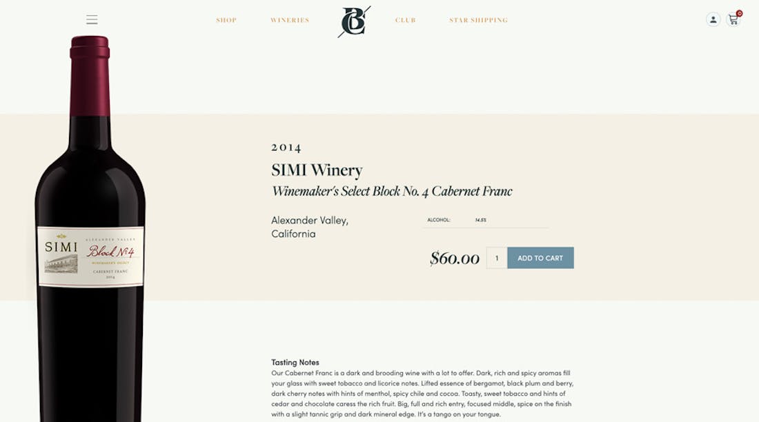
- They have a nice bottle shot, a title that stands out (product name), and the product description is not too short that it seems vague, and not too long that it bores people reading it.
- The Add to Cart button is noticeable and stands out with a quantity selector right by it. Easy and simple, just like it should be. You want to make sure your customers really see it – so you can increase your conversions or work in a retargeting sequence for people who added to the cart but didn’t purchase (but that’s something we will cover on another blog post).
- Pricing is evident and has good sizing, making it clear to customers. Positioning it right next to the Add to Cart button is a good call as well – especially if your product pricing is good.
Include additional, relevant information to make the product page richer and more convincing.
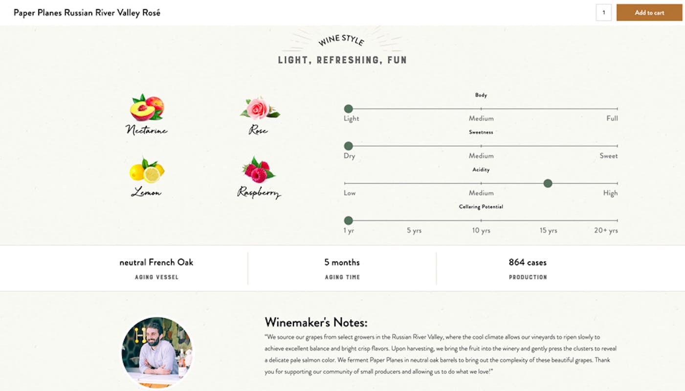
Now let’s take a look at Tasting Merchants product page. Below their product section, they have an additional product info section. Key information, ingredients, and wine attributes are very well presented in an interactive and visually appealing way – the user gets a real overview of the wine they're shopping for, leaving no blanks left in their mind. There’s also a picture of the winemaker giving info and thoughts on the production process - which brings some extra trust to the customer.
Notice also, that when you scroll down past the first add to cart button, a fixed top bar appears, containing the product name at the left, and the Add to Cart button at the right – making sure it’s visible and accessible all the way throughout the landing page. This is another very important thing to consider adding to your product landing page, in order to increase conversions or clicks which can get retargeted later on.
Include even more information on the winery to create brand affinity
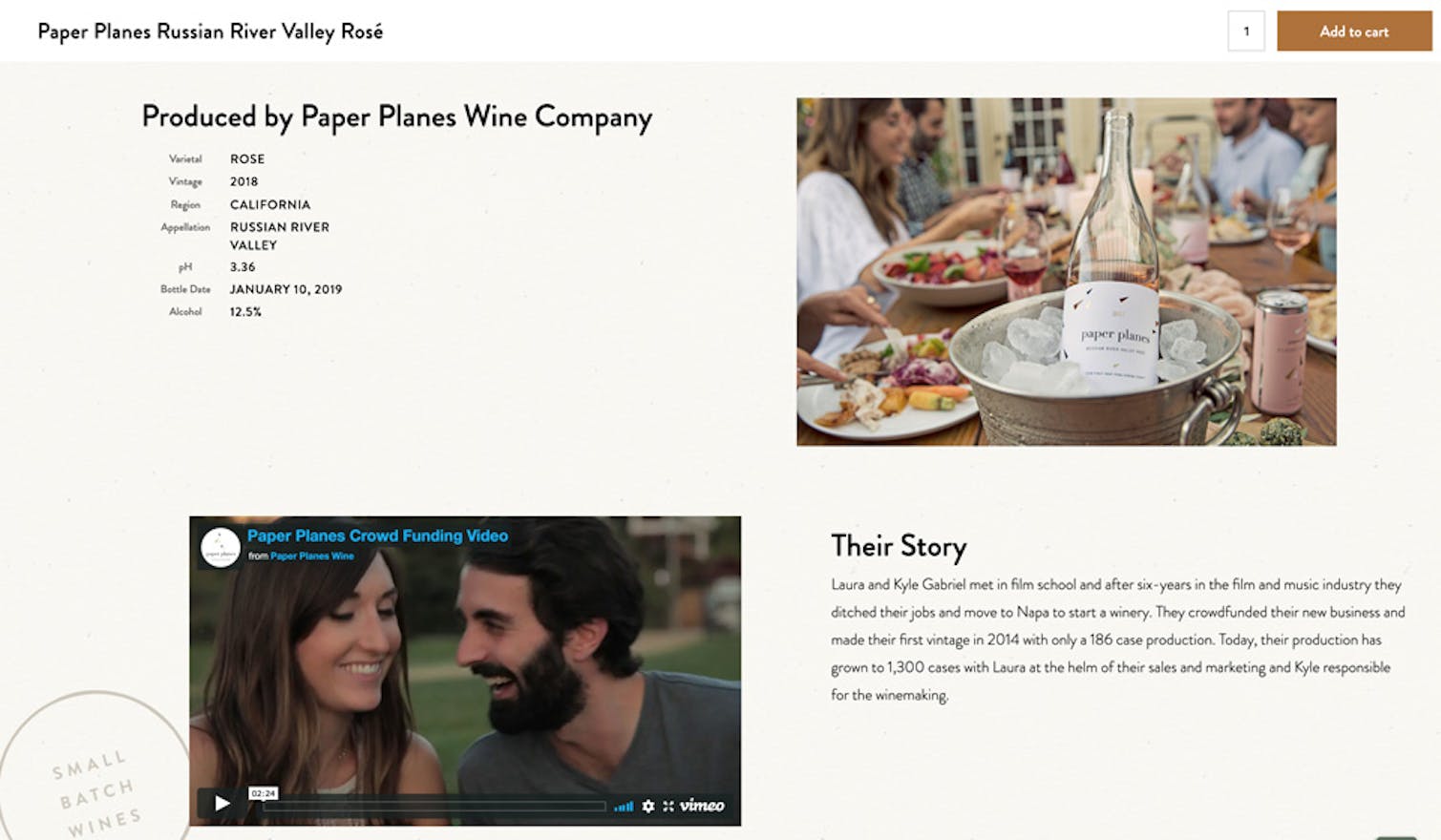
On the last section, there’s more technical information listed, containing the production year, location, vineyard, harvest date, bottle date, level of alcohol, ph and brie levels, grape varietal, with a photo of the winery on the right.
And last but not least, another photo of the producer, barrels, and a short text containing the story behind the winery. A nice detail also is the “Small Batch Wines” stamp watermarked at the left - which surely brings some extra value, making the landing page even more attractive for the customer to complete the purchase.
--
Ready to create better shopping experiences?
See Commerce7 firsthand by scheduling a demo with our team.
Schedule a Demo